
Lausanne Tourisme
As a destination, Lausanne somehow set back in the shadow of bigger cities like Geneva and Zurich, and was primarily known as the home of the International Olympic Committee. In collaboration with Lausanne Tourisme, we crafted a new positioning expressing the vibrancy and diversity of the city’s strengths, supported by a contemporary brand reaching a wide audience, from tourists to locals, from businesses to the media.
Saentys / 2018-2025
City photography by Phillip Waterton and Cécile Gretsch

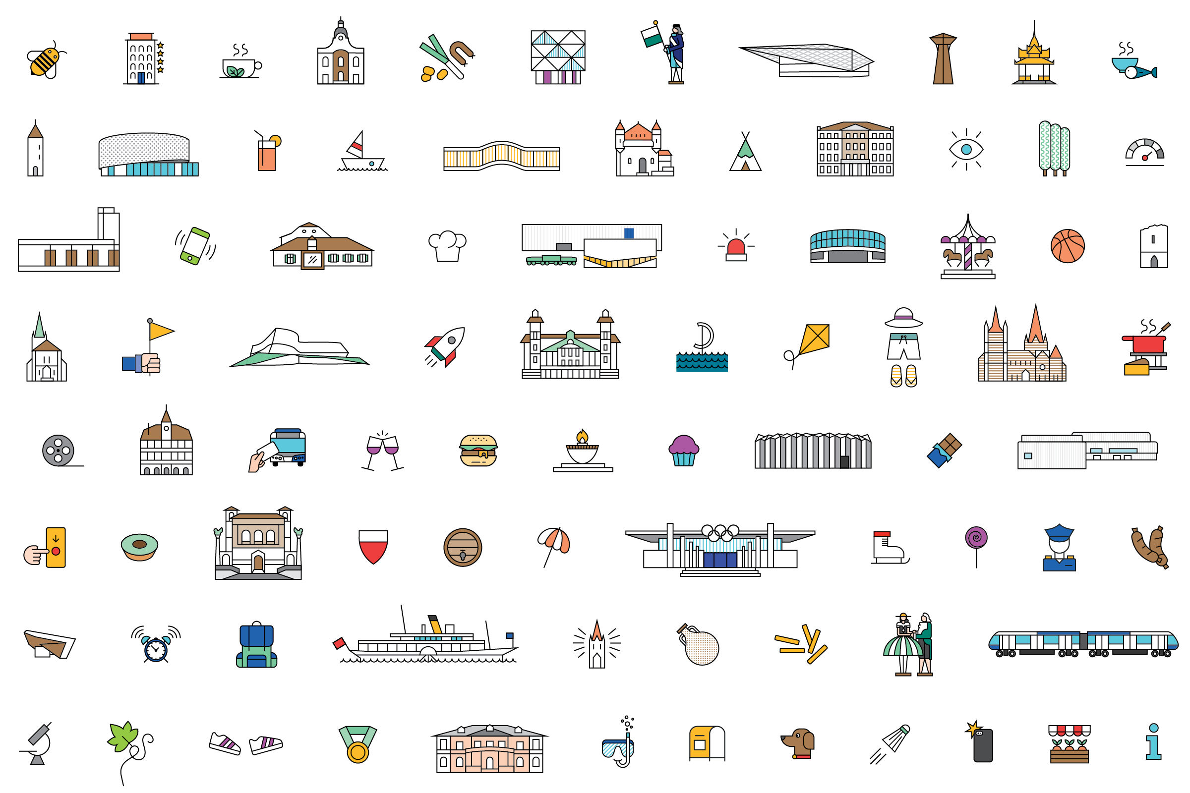
Our solution was to capture into a single, dynamic, logotype, what makes Lausanne uniquely charming: the Gothic cathedral, the many bridges and stairs, the lake and its Alpine panorama, and of course the Olympic rings.
Our creative solution highlights the city’s vibrancy, positioning it alongside Geneva and Zurich with a dynamic, stamp-like graphic capturing Lausanne’s core identity.


Stationery / Brand guidelines / PowerPoint Template / Annual reports
The lettering style was inspired by vintage advertising posters for the destination, specifically the one published by ADIL (Association des intérêts de Lausanne), now Lausanne Tourisme, designed by René Martin.
The rich, vibrant colour palette is inspired by the Olympic rings, the Geneva lake as well the architecture of the city.


Leaflets for city and region highlights and activities / Posters / Billboards / Product flyers


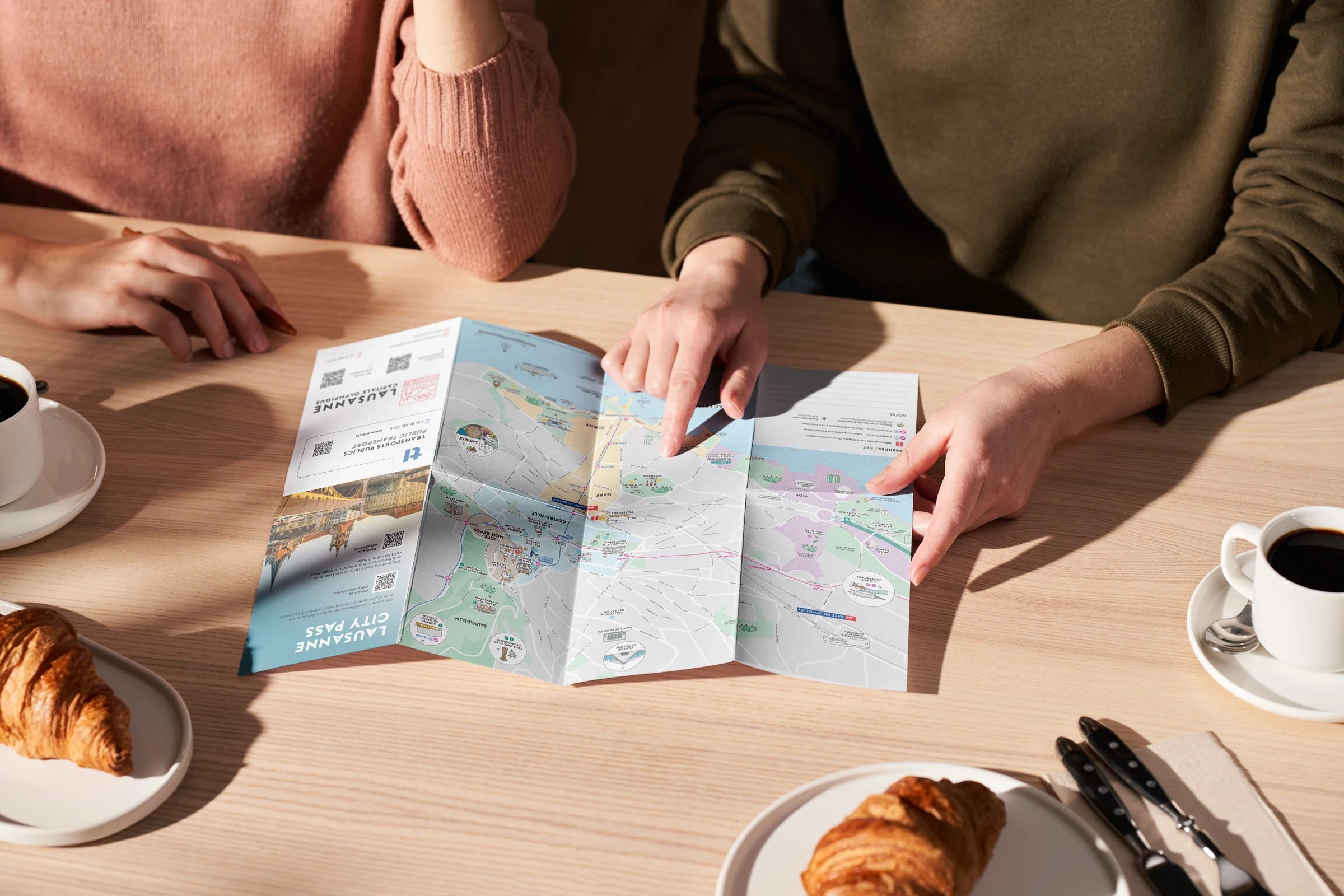


Tearable A3 block and A3 folded / Former Z-card format


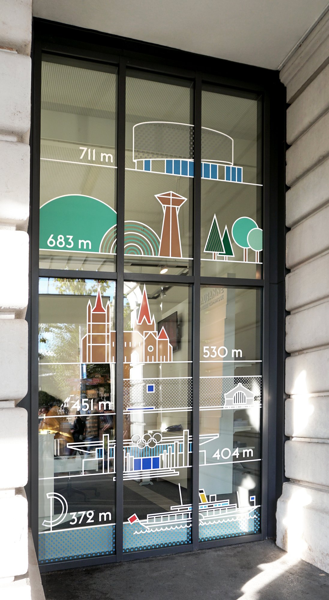
Signage elements for the new Tourist Information Center at Plateforme 10 / Window stickers for the former Ouchy office